Do You Know How To Create A
Professional Image?
You can create a Professional Image by following the Leading Edge Branding's formula for dressing successfully for any business situation.
DO I HAVE TO CHANGE TO CREATE A PROFESSIONAL IMAGE?
IS MY PROFESSIONAL IMAGE AFFECTING HOW I SHOW UP IN BUSINESS?
Is your image increasing your success potential, or is it a distinct liability in helping you reach your career aspirations?
Perception VS Reality!
When it comes to one's Professional Image three popular statements that come to mind. These statements need to be clearly understood when developing a Professional Image. Here are the three statements and then we will look at each of these a little more in-depth.
1. You never get a a second chance to make a first impression.
2. You cannot judge a book by its cover.
3. A wolf in sheep's clothing.
SCIENCE + ART = STYLE™
At Leading Edge Branding™, we have analyzed and worked with thousands of professionals on developing his or her professional image. What we have noticed through these years is that there are extreme image consultants/stylists that swing from one spectrum to the other.
On one side, some go strictly by science. If you “have” this, then you are “this”. For example, if you belong to “this” color palette, then you can only wear “these” colors from that palette. God forbid you to wear black when it’s not in your palette.
WHAT RULES CAN I BREAK WHEN IT COMES TO A PROFESSIONAL IMAGE?
Then you have the other extreme. It doesn’t matter what the “rules” are, break them all. It’s all about art and nonconformity. I often refer to this group as a stylist. Not all, but most, go with what’s in fashion. So, my response is, if it’s in fashion and it doesn’t look good on should you still wear it? To that, I say, no!
I am not insinuating that you should not incorporate fashion into your wardrobe, you should. It’s just how you do it. Let yourself dictate the look, not fashion; however, if you are wearing outdated things and out of fashion, then your personal brand will be perceived as outdated as well, so select wisely.
HOW DO I CREATE BALANCE WHEN IT COMES TO MY PROFESSIONAL IMAGE?
The key to building your professional image is to create a balance between the two. The science approach provides you the direction in where to begin building your image. The art aspect teaches you ways to “bend the rules” so to speak to create an image that is perfect just for you and only you.
SCIENCE + ART = STYLE WHEEL™
To make this an easy process, we created the “Science + Art = Style Wheel™”. It is important to know that these elements that make up this equation can be broken down into both a science and an art. Let’s look at each aspect of this formula and how you can apply it to yourself. You will begin to see that by combining each aspect from both perspectives (science and art), you will be able to make conscious, intelligent choices when it comes to building your wardrobe and being dressed appropriately at all times.
PLEASE NOTE: We are not suggesting wearing anything you want, whenever you want; this is not realistic; however, what we are suggesting is to take an inclusive approach to build your professional image that is representative of your personal brand.
What To Wear To Work!
To answer this question, you need to know that your Professional Image is built around the following 5-Primary Image Disciplines. This blog talks about each of these areas, generally speaking, so that you can become familiar with the terms and what to look for when developing and maintaining your personal brand. We will write more in-depth blogs on more specifics of each discipline.
1. Color
2. Style
3. Body
4. Face
5. Design
PERSONAL COLOR
science
The first aspect refers to your Personal Coloring. Color is the foundation for building any wardrobe and should not be taken lightly. Depending upon your personal coloring, specifhttps://leadingedgebranding.com/program-professional-image/ic colors can help you look fresh, component, and powerful, while other colors can make you look tired and washed out.
WHAT DOES COLOR HAVE TO DO WITH MY PROFESSIONAL IMAGE?
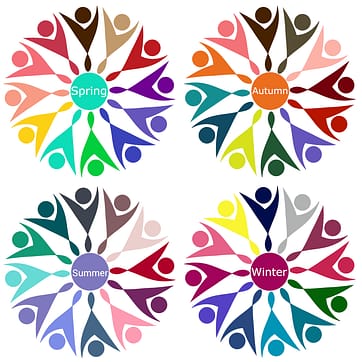
To make this easy for you, Leading Edge Branding™ created the Seasonal Digital Color Analysis Color to determine if you are a Spring, Summer, Autumn, and Winter. These four palettes help determine which “colors” best harmonize with your skin, hair, and eye colors, therefore, making it easier to determine which colors are best for your clothing, hair, makeup, and accessories. If you follow the “Color Concept” for each palette, then you will enhance your professional image tremendously!
Take the Seasonal Digital Color Analysis™ by clicking here.
These palettes were created as a new generation of color analysis, which was made most popular by Carole Jackson, who created the Color Me Beautiful system, where she categorized your coloring as a Spring, Summer, Winter, or Autumn. Working with Carole and her team earlier in my career, and as their national trainer, I learned a great deal. I am where I am today because of Carole’s creations. Thank you, Carole!
As I moved into corporate America with this newfound journey, I began to see how adjustments needed to be made to make the information more marketable for men as well. Male CEOs didn’t like being called a “Spring”, so we have new color system for men coming up in the fall of 2023.
We also added new colors and changed names to accommodate the current market. In addition, we created the Numerical Charting System™ so that professionals could learn how to make the most of their budget wardrobe dollars. In short, our system reduces your shopping time by 50% and your mistakes by 100%.
You can check out our Professional Image Programs by clicking here.
These palettes are designed by a scientific approach; however, how you apply them is as much about science as it is art!
Suffice to say, it’s great to know that you fit into one of these categories. It provides you direction on where to begin making conscious color choices for your wardrobe, accessories, makeup, and hair; however, there is the aspect of personal taste.
Color Concepts

WARM
LIGHT
CLEAR
The SPRING palette consists of warm, light, clear colors. This does not mean that it does not have dark colors, but even those colors have a lightness to them. A Spring's coloring is typically clear and transparent, like that of a flame.
Their personality is often bubbly and outgoing, the life of the party. They have a sparkle in their eye. The more “golden” Spring will wear warmer colors better, such as salmon, gold, and peach. A less “golden” Spring will wear the “cooler” colors of the palette, such as aqua, periwinkle, and coral.

WARM
DARK
MUTED
The AUTUMN palette is unique, as it consists of warm, dark, muted colors. There are some Autumns that can wear brighter colors, like the Fall time of year when the leaves begin to change. Think of pumpkins, reds, and bright yellows. As these colors tone down, they become richer; eventually becoming muted. There are some Autumns that look best in the muted colors of the palette. And some look great in both the bright and muted colors.
They are grounded and sensible in their personality. Many Autumns enjoy outdoor activities such as biking, hiking, or gardening, and typically like casual clothing that’s textured and comfortable.

COOL
LIGHT
MUTED
The SUMMER palette consists of cool, lighted, muted tones. Their colors are “heathered” in nature, as the SUMMER’s personal coloring is as well. This soft contrast between the skin, hair, and eyes is typically accompanied by a soft, amiable personality. Mostly they are quiet and aesthetic by nature.
Summer people gray softly and slowly. They tend to become more attractive as they get older. Their “colors” can get “too” bright for the total look because it can be overwhelming of their inner essence.
The personality of this palette is that they are approachable and have a very aesthetic nature about them. Sophistication often comes to mind.

COOL
DARK
CLEAR
This WINTER palette is made of cool, dark, clear colors and is typically best worn in sharp contrast. There is typically a hi-contrast between the skin, hair, and eyes, which is why the colors from this palette work so well when worn. They should avoid earth tones around the face completely. Particularly the “olive” complexion.
Be careful not to mistake this complexion type as warm, because it has a blue (cool) undertone as all Winters do. It’s called olive because the skin has a green cast. Although technically, olive is a warm-green color. An olive complexion sounds better than a green complexion.
The personality of this palette is aloof. Not rude, but they appear to “process information” as they listen. Typically, this person looks best in solids. May wear some stripes but not a lot of patterns.


